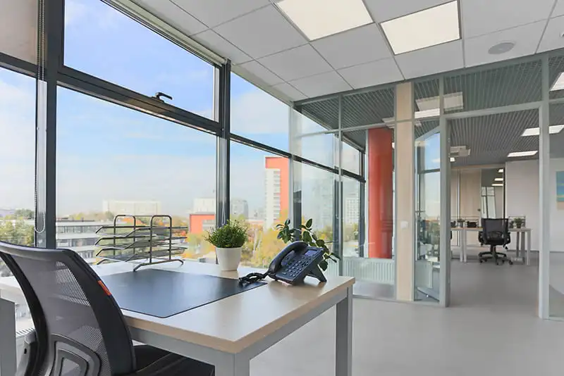
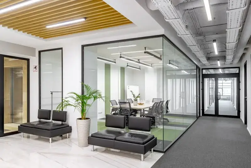
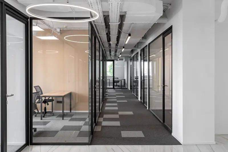
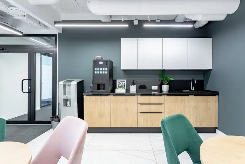
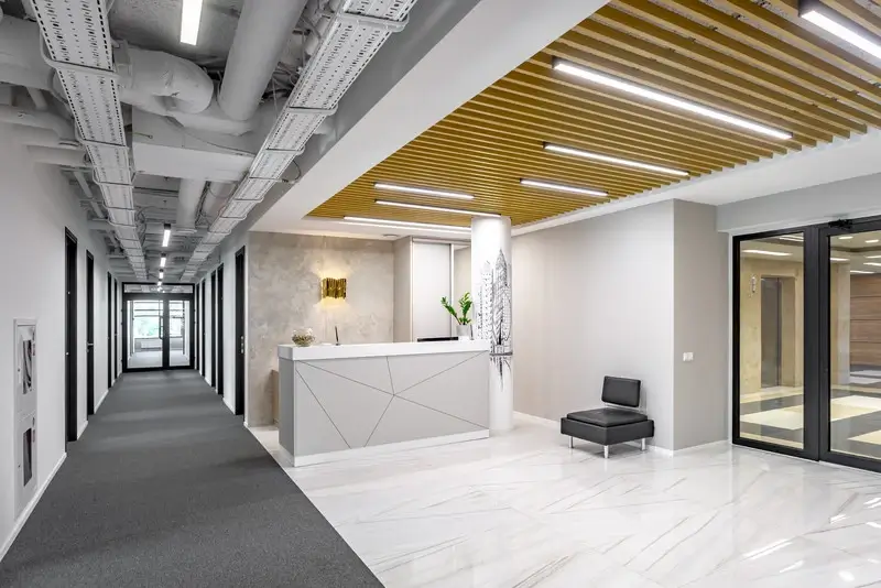
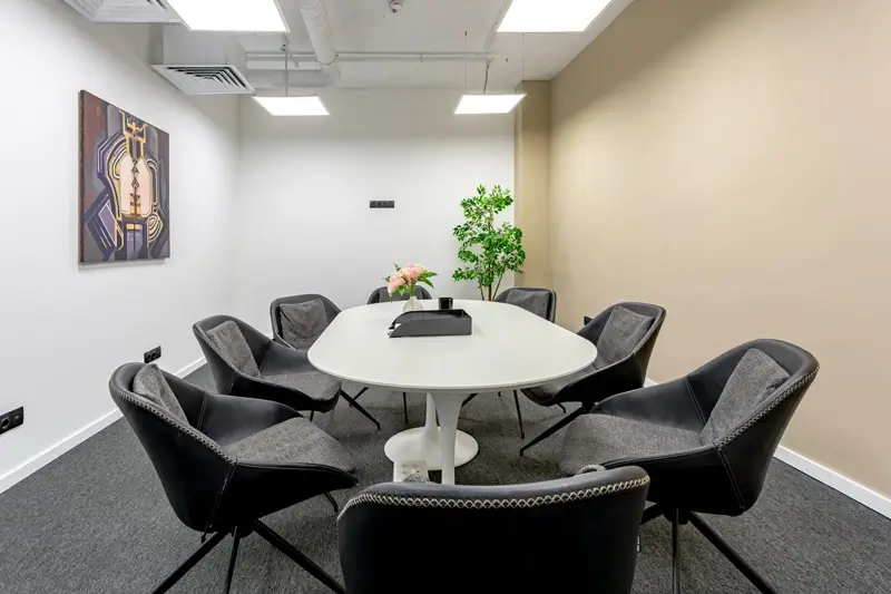
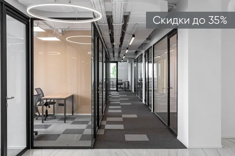
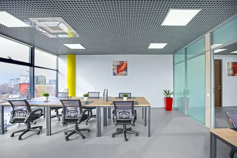
A common misconception in automobile racing is that the limiting factor in how fast a racing car can travel around the track is the amount of horsepower under the hood. While this concept has been pounded into our heads by the millions of car advertisements, the simple truth of the matter is that there is another factor that’s far more important. It’s what helps to explain how the Ariel Atom or the Gumpert Appollo, while not being the most powerful cars, are the fastest around a track, and that factor is traction.
In BI, we’re often sucked into the client’s wishes for more functioanlity, more complex reporting, more, more, more…but it’s our jobs, as a consultant to direct the client into the fastest way around the track, not just cramming the most bells and whistles into the package and slamming a beastly server under the hood. It’s often easy to forget, amid the 100′s of status calls, discussions, planning sessions, POC’s, etc, that it’s necessary to have restraint and not just give the client everything they are looking for.
Using my car analogy, I’ll go back to a Tom Cruise classic, Days of Thunder. There’s a particular scene where the hot shot race car driver (Tom Cruise) wants to run around the track as fast as he knows how, but in turn, destroys his tires, thus costing him a quality lap time. Eventually, with coaching from his driving instructor, he learns how to best use his car on the track and performs better overall. This is essentially the same thing that we try to do on a daily basis, coach our users and BAs into creating a product that will be the fastest around the track without slamming a $3M server into to the environment just to mask a design issue.
Some ways that I have been successful in the past at convincing clients to take a more ideal path around the track:
- Stories. Nothing works better to convince a client to go one way or the other than telling them a heart felt horror story of someone else’s mistakes and where they ended up.
- Common sense. Stepping back from a proposed solution and looking at a top down approach and explaining, with clear and simple logic why a different approach may be better suited has often led to changes in report design.
- Examples. The one thing that we, as report developers often take for granted, is that we already know how the tool will look and how it will perform given certain tasks, but this knowledge isn’t something that we can always easily convey to a user. Sometimes the best way to achieve this is to make an example. Sometimes spending an hour to create a mock-up will save you 20 in development and rework.
-Ask the annoying question….”Why?” I’ve often seen that users will make requests for reasons like “Well, such-and-such program did it that way” or “It just seemed like the right thing to do”, when in reality, typically a much simpler design is going to almost always work out better for both the end user experience and the functionality of the analytics being presented.
Happy Reporting


